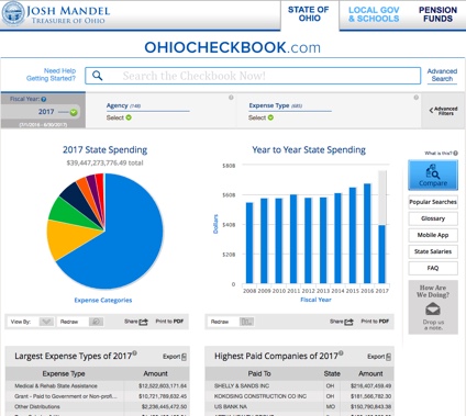
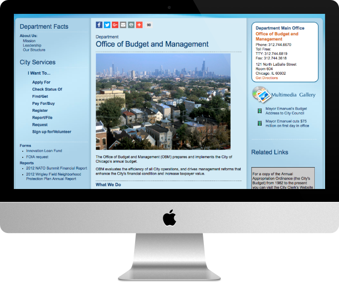
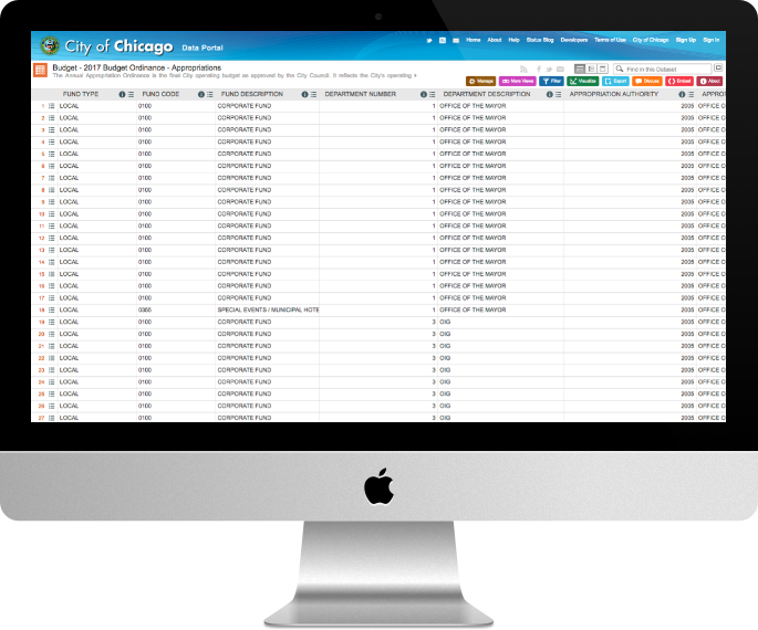
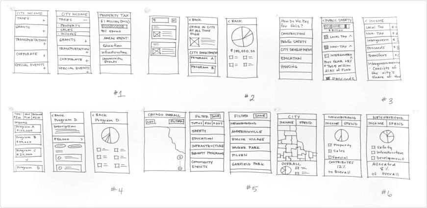
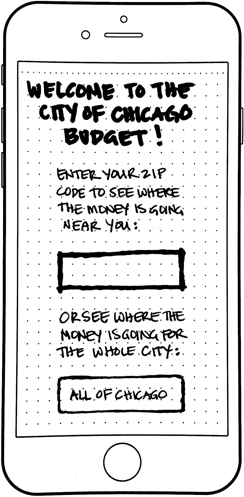
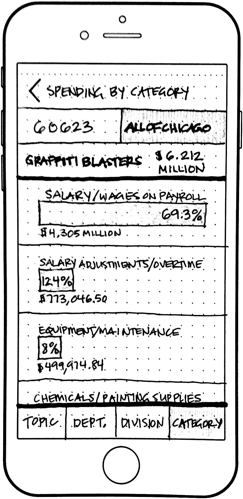
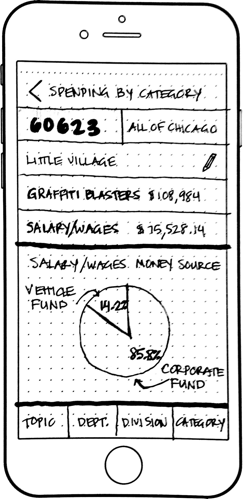
The city of Chicago website is an important resource for residents. It provides information on local officials, city council meetings and voting histories. Residents can find service information on permits and inspections and research city budget information. While the site acts as an always ready city employee, things could be better. Sites that provide a lot of information can be hard to navigate. This is why my team and I received the prompt to create a microsite for the city of Chicago. The site had to streamline access and clarify information listed above.
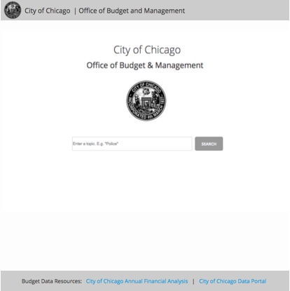
Being diligent UX designers, we wanted the users to tell us which area to explore but initially assumed residents would want a microsite on government services or elected officials.
We developed a series of questions with our assumptions in mind. We wanted to get people talking about their relationship with the city and how they felt about it. We inquired on the current city site, asked about government services and local officials, and posed open ended questions about what citizens want to know about the city. We armed ourselves with candy bars and smiles and headed to the Olgilvie Transportation center to conduct interviews.
The city of Chicago is the third largest city in the United States. We had to make sure interviewees were as diverse as the population they represented. African American, Hispanic and Caucasian individuals of both genders were among our interviewees. We made audio recordings to capture all the insights and to allow us to be “present” during the interviews.
This is the part where I tell you that we were wrong. We assumed government services and local official information would be important to residents, but our interviews contradicted those assumptions. The Individuals we interviewed cared about transparency. They didn’t trust the city and they wanted to keep an eye on it. Was there an area of the city that needed transparency more than any other? Yes, to our surprise, the residents we interviewed wanted budget transparency.
We focused on building a City of Chicago budget microsite. We looked at government budget sites and found a few interesting examples.
During domain research we learned that Chicago rates high for publishing budget data. If the City of Chicago is doing such a great job of publishing data, why don’t the residents agree? We looked at the Office of Budget and Management page.
To navigate to the data users must complete the following steps:
Following the links leads you to a giant spreadsheet which users can filter and manipulate. Which is nice if they know what they're looking for.
It took me around 20 minutes to find the data I was searching for. I would have stopped and turned to Google if I didn't already know the data was there.
Chicago publishes data along with an annual financial analysis. The analysis explains the raw budget data. But the financial analysis is in a separate file and uses a separate link to get to it. To review both the data and the analysis, users must navigate between the two.
So it was true that the City of Chicago was publishing its budgetary data, but it was hard to find and even harder to grasp. As one of our interviewees stated:
“You have to be savvy to find this information. The city hides it, buries it in layers.”
This insight led us directly to our problem statement.
The city of Chicago is doing an excellent job of publishing raw budget data. However, residents must invest a lot of time and effort to organize and understand the various documents and how they relate to one another. How might we present city budget information in a way that gives the information context?
Our next step was to begin ideating. We were on week two of four and needed to make some fast decisions on the form the microsite might take. We came up with 6 concepts and sketched them out. Each concept presented budget information by organizing it a different way. Our goal was to make information easier to find and understand.
We took the sketches out for concept testing and came away with some very useful feedback. Residents wanted context. They liked concepts which gave them an overview. We learned that residents identified themselves by neighborhood. They enjoyed seeing budget information specific to the neighborhoods where they lived. They want to compare money spent on their neighborhood versus other neighborhoods. For them, this could be a very powerful tool to fight corruption, proving or disproving links between privilege and resource allocation.
In our next round of ideation we took the feedback and developed three paper prototypes from it. The prototypes included neighborhood overviews, topic related organization and in depth budget information. We integrated these features to give context to the information. Information was related to the local area users cared about and gave them the tools to explore further.
The first prototype let the user enter a zip code or view the entire city budget. Users could toggle between a neighborhood and city view from all interior pages. More navigation led to budget information based on topic, department, division or category. These breakdowns are current data segments in the Chicago data portal.
The second prototype used pie charts to give overviews. Topic breakdowns listed percentages and budget numbers. Users could click on a segment list item and drill in for more details.
My prototype immediately listed the current city of Chicago budget total. It directed users to enter a zip code to get neighborhood specific information. I used simplified pie charts and bar graphs to stratify the spending breakdown. I wanted to diversify the way I displayed the data as an overview to make it more clear and concise. I wanted to gain insights on which visualizations worked better. My goal was to uncover any problems with the amount or type of data displayed.
The paper prototyping test results revealed something tricky about tests. Not all problems are found in a round of testing. During concept testing users indicated that they understood the topic based organization. But we failed to consider that each user would have different ideas on what budget data belonged under a given topic. For example, we asked the testers to find the annual budget for a program called Graffiti Blasters. Using the City of Chicago site as our guide, we placed the graffiti blaster budget under safety. The city of Chicago considers graffiti a safety concern. Users consider graffiti removal a matter of infrastructure or maintenance. The placement of the data confused users and they had a hard time finding the information.
Furthermore, concept testing didn't uncover that users still found the information hard to interpret. One of our paper prototype testers understood the numbers themselves, but he didn’t understand what the numbers meant to him. We showed users how much graffiti removal costs, but it didn’t mean anything to them personally. The level of data granularity we provided seemed to confuse rather than clarify.
How could we present data users cared about in a way that gave it context? Our solution was to reduce the amount of data we would show. We removed topic categories and showed more concrete neighborhood-centric budget information. We wanted to show them a simple slice of the city budget. Their slice.
We created a medium fidelity Axure prototype of Simple Slice which featured a search bar on the home page. The idea was to allow users to type in a topic of interest and match it on the back end to departmental spending. We took this idea from the many government sites we had reviewed in our domain research. This eliminated potential errors in matching the data to user mental models.
We entered usability testing confident. We were getting close to our final product. Users found the mid-fidelity prototype easy to use. They were able to complete the required tasks and liked the types of budget data we presented. But they didn't like that we had constrained the flow.
We had presented information they cared about in a way they liked, but we didn’t let them explore it enough. For the first time since ideating and testing, users wanted to spend time on the site. That was good news. The bad news was, they couldn’t do it without returning again and again to the homepage to search a new topic. In our quest to simplify, we had over simplified!
We adjusted our approach to include a more traditional homepage that explains the purpose of the site and gives the user a clear call to action. The navigation expanded to give users the ability to explore. The result is a microsite that uses cards to present data while reducing development overhead.
The site maintains a visual vernacular and emphasizes recognition over recall. Final user testing shows:
The microsite we designed gives users budget information in a relatable way. Users can see the budget in action in their neighborhood. It gives them a sense of how their neighborhood relates to the city as a whole. Links to the raw data and financial analysis are available for those curious enough to learn more.
Moving forward, Simple Slice can improve the data visualizations. Icons and numbers illustrate the budget but lack sophistication. The site should inform users on how the budget works and emulate the impact of budget decisions. Comparison tools should expand information statewide and to the country as a whole.
When I began this project, I assumed the citizens of Chicago wanted a better way to pay parking tickets. When my teammates and I looked at the concept test results we assumed our topics were clear. When we developed our mid fidelity prototype, we assumed that simpler was better. If we failed to test our assumptions with user interviews and usability tests we would have missed both the problem and the solution.
As a designer, this project taught me to test my assumptions and to get feedback early and often. This was the first project I used concept testing in. Before Simple Slice, I invested more time than necessary creating many paper prototypes. With concept testing, I put loose ideas in front of users and gained useful insights. I was able to weed out poor ideas early and reduce the amount of time spent on them. Each project I've worked on since Simple Slice has integrated this invaluable tool.
It's easy to become comfortable with tools and rely on them to do too many tasks. One major takeaway from this project is the importance of considering which tools to use. It is important to use the flexibility of the tools without misusing them. Use the best tool for the task.