ShedWool project

February 2017 Role: UX Designer Project timeframe: 3 weeks

0.0 project background

ShedWool is an app born out of necessity when our client’s employer decided to stop using a similar app because of cost constraints. Most apps that solve for shift scheduling issues are subscription based. ShedWool is different because it is a free app that relies on ad revenue. This opens the platform up to small and large companies alike. Prior to apps like ShedWool, shift work employees and their managers had to create schedules the “old school” way. Tracking shifts using spreadsheets, paper print-outs with written corrections, Post-it notes with requests and planner “books” for future requests.

When DESIGNATION was approached, ShedWool had already been available on iTunes and Google Play for five months.The client wanted to simplify its interface and emulate apps he enjoyed, like Twitter and Snapchat. The working version was built on wireframes he drew himself and featured functionality inspired by apps he used as an employee of a major Chicago restaurant chain. He realized he had to make ShedWool stand on its own.

That’s where we came in. We were asked to talk with users and identify areas of improvement. The scope and focus area were up to us, but we were asked to target restaurant employees as the primary users. I was excited to work on an app that was already in the market, had users and was more robust than an MVP.

tl;dr: Redesign ShedWool a shift scheduling app currently on iTunes and Google Play.

1.0 the research

We had a very specific target user, a client who was intimately familiar with the landscape and a product based on other successful products. I felt confident that we could move directly into usability testing.

Departments page
Shift block page
Schedule page
The application as it looked the first day we started the project.

As we developed our test plan I walked through some of the tasks we intended to ask of the users. While I had never worked in a restaurant, or managed a team of shift work employees myself, I assumed I could navigate the app without issue. I was surprised to find that I was confused by the schedule view and the concept of shift blocks. Our tests integrated each of our assumptions. My assumption was that users would want to see a calendar view of some kind.

Testing stas
Usability testing the initial ShedWool app.

We tested five people from the restaurant industry, two managers and three waitstaff. Using the current app we asked users to complete a simple series of tasks. For management, we asked them to add a new employee, schedule that new employee and check the staff coverage for Valentine’s Day. For employees, we asked them to find the next day and time they were working, pick up a shift and request time off for a specific day. At the end of testing we asked retrospective questions around the overall function and expectations of the app.

1.1 testing takeaways

Alarm clock icon

Availability vs. Time off

Users were confused between the two. Every tester clicked availability to request time off.

Check icon

"Free" shift

Needed context. Was free indicating the user was free that day, or that there was a free shift to pickup?

Calendar icon

Week View

Users were confused by the vertical arrangement of days. Prefer a calendar view for dates.

Nav icon

Navigation

Duplication of navigation links between dashboard and hamburger menu confused users.

The testing helped us validate some of our assumptions and uncover basic issues users had with the overall app. My assumption about the calendar view was validated; however shift blocks were commonplace for managers and were not an area of concern. We were ready for some in depth interviews.

1.2 user interviews

We spoke with four managers and five employees. Our questions for management focused around building schedules, common issues or pain points and specific app usage. Questions for employees focused on how they communicated their scheduling needs to managers, managed changes and general attitudes on the scheduling process. The interviews gave us a solid understanding of the shift schedule lifespan.

Description
Stage 1
Stage 2
Stage 3
Shift schedule journey map

1.3 interview takeaways

Affinity diagramming
Our research uncovered a number of pain points for both employees and management.
Speech bubble alt

Management takeaways:


Managers were stressed early in the schedule lifecycle but they had ways to manage the situation. Typically, managers created set schedules for their long term career servers. It was the part-time staff they had to worry about and after schedules were made, they placed responsibility of finding scheduling changes on the servers.

  • Rely on employees to give accurate data before making schedule.
  • Stressed by gathering data and synthesizing into a schedule.
  • Try not to overwork employees.
  • Post schedules in advance whenever possible to avoid last minute conflicts.
Speech bubbles round

Employee takeaways:


  • Stressed when they are unsure about their schedule.
  • Prefer direct communication for immediacy.
  • Find remote communication frustrating.
  • Want more info on management decision making process.

For employees, finding resolutions to scheduling conflicts meant reaching out to one another and negotiating. Interviewees said negotiating in person during work was the best way to handle this. Face to face communication while at work allowed employees to review the most current version of the schedule, negotiate a swap and gain management approval quickly.

App icon with bubble

ShedWool takeaways:


Having worked with small businesses in the past, I saw an opportunity for ShedWool to set itself apart by improving these actions. I considered the challenge facing ShedWool one of overcoming the issues that remote negotiating posed.

  • Unnecessarily complex.
  • Too many ways to access same functionality.
  • Verbiage is unclear
  • Employees won’t use all of the tools they are given.
  • User interface lacks recognition and taxes user’s memory.

Focus on employee side

The team discussed our options and decided to focus on the employee side of the app. We would focus specifically on shift actions such as swapping a shift, dropping a shift and picking up a shift.

2.0 beginning to ideate

From my previous projects I had come to love concept testing as a great way to get early feedback on rough ideas. We spent one of our three weeks testing the current product and interviewing users. We agreed as a team to spend the second week testing concepts and refining them. We didn’t want to take a lot of valuable time crafting clickable prototypes and focusing heavily on interactions. During this week we went through three rounds of concept testing. Each round built on the previous and introduced a new flow.

Whiteboard wireframe
Working together to sketch out a cohesive experience.

Round One

For our first round of testing we focused on the shift schedule view. This would be the default screen a user saw after logging in, and it was the primary starting point for all shift action flows. This was also the best time to introduce our various navigation styles so we had plenty of time to iterate.

We tested:

  • Menu type and options
  • Employee shift schedule view
  • How to pick up a shift flow
R1 concept1
R1 concept2
R1 concept3
Round one concept sketches from left to right (concept 1, concept 2, concept3).
Check circle

Bottom navigation

Bottom navigation was universally favored by test participants.

Check circle

Icons plus text

Icons plus text gave users clarity on navigation items.

Check circle

Playful

Playful icon of a man in a hammock made app feel friendly.


Round Two

Each team member iterated on their concept. The feedback I received on my concept was pretty positive. I made a few tiny tweaks to the wording on the pick up shift indicator which was the main pain point for users.

We tested:

  • Shift swap flow
  • Pick up shift changes
  • Shift schedule view updates
R2 concept1
R2 concept2
R2 concept3
Round two concept sketches from left to right (concept 1, concept 2, concept3).
Check circle

Week view

Users liked choosing a shift to swap with from a list broken down by week.

Check circle

Swap status

Desire for visible list of swap status steps and confirmation of what step the swap was on.

Check circle

Pick up shifts

Picking up shift action should happen from within the schedule view.


Round Three

Much of my first two concepts had received positive feedback. My iterations focused on the new concepts introduced with each round of testing. For the final round we were looking at the time off flow which had a completely different start point and series of screens. I hoped to learn the most about what worked for this flow.

We tested:

  • Schedule view improvements
  • Drop shift flow
  • Time off flow
  • Time off view
R3 concept1
R3 concept2
R3 concept3
Round three concept sketches from left to right (concept 1, concept 2, concept3).
Check circle

Upcoming shift

Positive reaction to viewing upcoming shift at a glance.

Check circle

Total hours

Users want to see hours scheduled and worked.

Check circle

Shift status

Shift status from any view is important.


Check circle

Month view

Positive reaction to month view option.

Check circle

Time off titles

Titles for time off requests should be optional.

Check circle

Shift view actions

Initiating actions from shift view was useful.

2.1 main concept takeaways

  • Integrate a full week view and a month view.
  • Users prefer to complete all shift related actions from within the specific shift.
  • Maintain the ability to request time off from within the app.
  • Give users request status at a glance.
  • Available pickup shifts should be integrated into the calendar views.
  • Include visibility of total hours scheduled/worked for the week.

3.0 final design

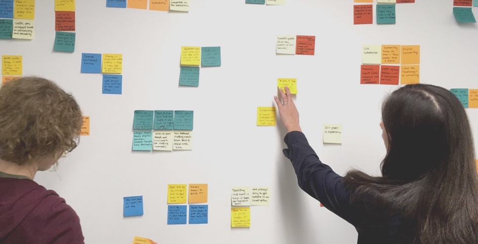
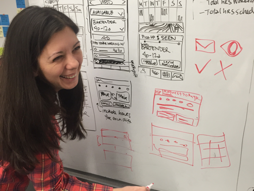
Many rounds of concept testing helped us solidify the areas we should focus on and how they should be presented. We busied ourselves with combining the best of what worked.

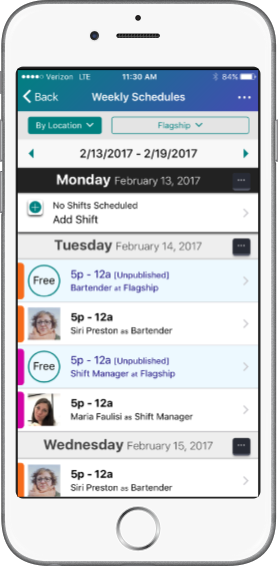
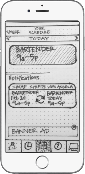
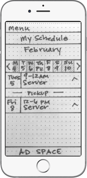
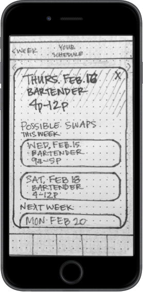
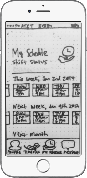
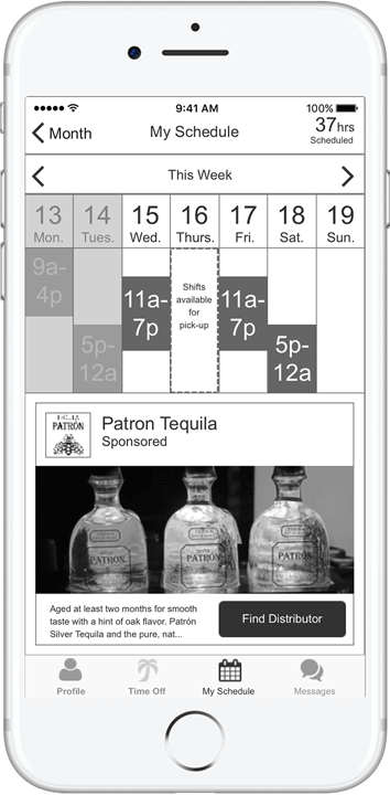
The final prototype integrates a week view, and allows users to initiate all shift actions from the schedule view. It displays available pickup shifts within the week view and integrates all actions from the shift itself. The time off page is clean and features a large CTA for new requests.

As we ended our final days of the project, we tested the prototype to gauge its effectiveness. We tested two random users and made quick fixes before testing the final three. We asked prototype testers to complete the major employee shift actions.

Pickup shift 85% Faster

Thumbs up icon

Request time off 23% Faster

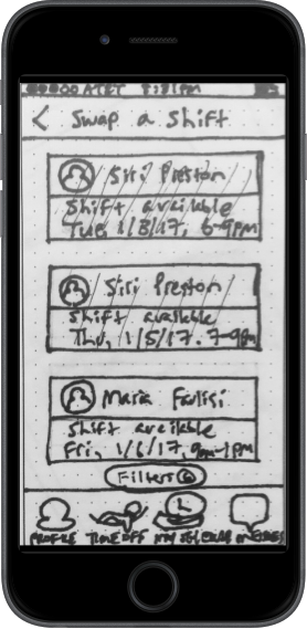
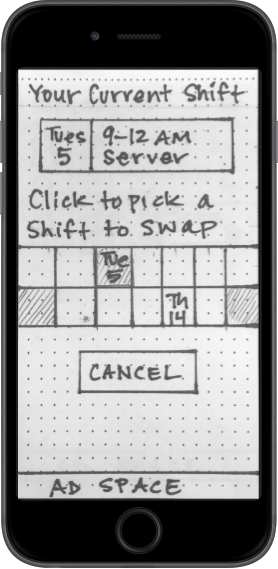
The current app didn’t have swap shift functionality. Testers enjoyed it and found it easy to use.

Shedwool demo trimmed
Final ShedWool prototype

4.0 moving forward

Overall, I think the app would benefit from more testing of the schedule week view interaction. I’d suggest using real data from a few user schedules to make sure the space required is sufficient. Currently, the week view is tidy having only a single shift scheduled. But from the user interviews I know that there are edge cases where double shifts and open ended shifts are normal considerations. Once the employee side has been finalized, focusing on the manager side of the same interactions would be a natural next step in UX design and development.

Our closing feedback to ShedWool suggested the following features to integrate in future versions:

  • Group messaging
  • Multiple employers single employee interface
  • In-app translations
  • Integration of digital schedule board
  • Paycheck tracking

5.0 final reflection

My final project with DESIGNATION was a positive one. I integrated lessons learned about concept testing and working as a team to draw out pages. Iterating using a fast and loose methodology positively affected our final concept. We were able to get to a cleaner better interaction without wasting a lot of time. Getting the concepts pinned down faster allowed my team to test more often and with greater impact.

The client was happy with the progress we made. He felt that the interface we designed was visibly and functionally better than his competitors and from his current app which was based on those competitors. He felt that his app was overly complex and built using an engineer’s mindset. It was logical, but didn’t focus on usability. The final wireframes are cleaner and focus on minimizing the number of views. While the design itself does not look like the apps he wished to emulate, the changes made are at the heart of what he wanted most.